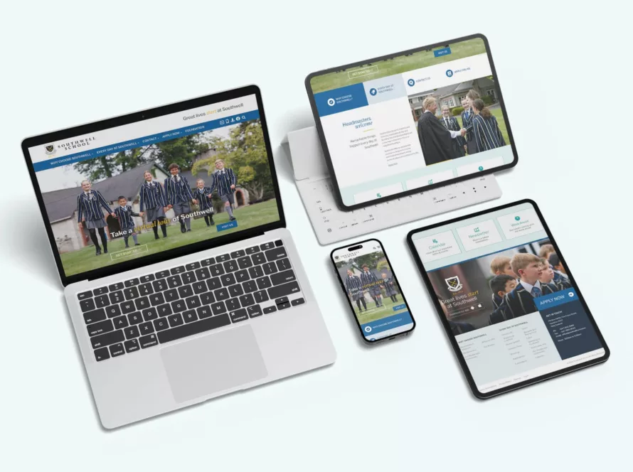
Is your website mobile friendly?
If not, now is the time to change it!
Consumers are constantly using their mobile phones to research everything and anything from the best local café to pet insurance.

So now that you’ve got your website sorted and it is mobile-friendly, you need to think about the speed of your website. The Senior Vice President of Google Search has announced that over half of the 3.5 billion searches conducted on Google each day come from mobile devices. The trend continues for 2018: mobile sites, site speed and image sizing are the things to get right. I want you to think about the last time you loaded an image onto your website. I’m guessing it had a pretty generic name such as “ud000162.jpg“. This type of name means nothing to Google. You now need to ensure that every image filename is descriptive and provides a relevant heading or caption as this helps Google assess the relevance of an image and it is more likely to appear in searches. So if you provide mountain biking insurance, name the image “mountainbiking-insurance.jpg“. Now, if a consumer searches for this type of product, your image and website is likely to appear nearer the top.
Over half of the 3.5 billion searches conducted on Google each day come from mobile devices.
Today’s consumers are impatient and want information right then and there. If a search of your website is taking too long on their phone, they will quickly move on. Google will soon start sending searches to Accelerated Mobile Pages (AMPs). This is a new initiative from Google and Twitter that is a format for publishing content and is designed to make mobile pages really fast. The idea of the AMPs is that they are designed for pure readability and pure speed. Images will load as they are scrolled into view. Google hosts your content right there so they don’t need to retrieve it for you anymore. As I said, pure speed. So how do we prepare for the coming of AMPs? Firstly, build AMP pages and make sure you do it right. This can be tricky, so call the web developers at Ultimate Design to discuss how this can be done for your site. We need to be ready for when AMP arrives to ensure you get a mobile head start. So, on your to-do-list add “Call Ultimate Design”, and discuss making your website mobile-friendly, renaming images on your website and building Accelerated Mobile Pages. We can go through costs and logistics of doing this to your website.

